Reaktor_Crafting a flexible visual identity
system for Reaktor’s global vision.
Reaktor_Crafting a flexible visual identity system for Reaktor’s global vision.
Reaktor_Crafting a flexible visual identity system for Reaktor's global vision.
Reaktor_Crafting a flexible visual identity system for Reaktor’s global vision.

(Overview)
(Overview)
(Overview)
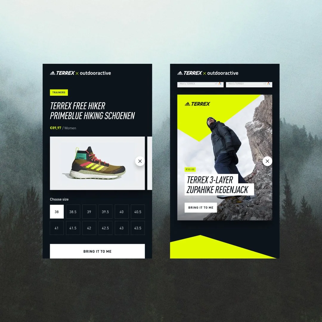
Reaktor is a global technology consultancy known for delivering category-defining digital products and building high-performing teams. In 2023, Reaktor set out to unify its identity across a growing, multidisciplinary organisation operating across industries, cultures, and geographies, from adidas to HBO, Helsinki to Tokyo.
The challenge wasn’t visual variety, it was coherence at scale. Reaktor needed an identity system that could flex between restraint and expression, supporting different teams, audiences, and contexts, while still feeling unmistakably Reaktor.
While select elements of the previous identity were retained, including the logo, symbol, and display typeface, the wider system was reimagined. Working closely with the Reaktor team, we reshaped the identity around their global strategy, creating a clearer, more robust foundation designed to evolve with the organisation.
Reaktor is a global technology consultancy known for delivering category-defining digital products and building high-performing teams. In 2023, Reaktor set out to unify its identity across a growing, multidisciplinary organisation operating across industries, cultures, and geographies, from adidas to HBO, Helsinki to Tokyo.
The challenge wasn’t visual variety, it was coherence at scale. Reaktor needed an identity system that could flex between restraint and expression, supporting different teams, audiences, and contexts, while still feeling unmistakably Reaktor.
While select elements of the previous identity were retained, including the logo, symbol, and display typeface, the wider system was reimagined. Working closely with the Reaktor team, we reshaped the identity around their global strategy, creating a clearer, more robust foundation designed to evolve with the organisation.
Agency
Agency
Reaktor
Reaktor
Industry
Industry
Design & Technology
Design & Technology
Services
Services
Brand Assets
Brand Identity
Creative Tooling
Design System
Identity Guidelines
Key Messaging
Website Design
Brand Assets
Brand Identity
Creative Tooling
Design System
Identity Guidelines
Key Messaging
Website Design
Website
Website
reaktor.com
reaktor.com




(Strategy)
(Strategy)
(Strategy)
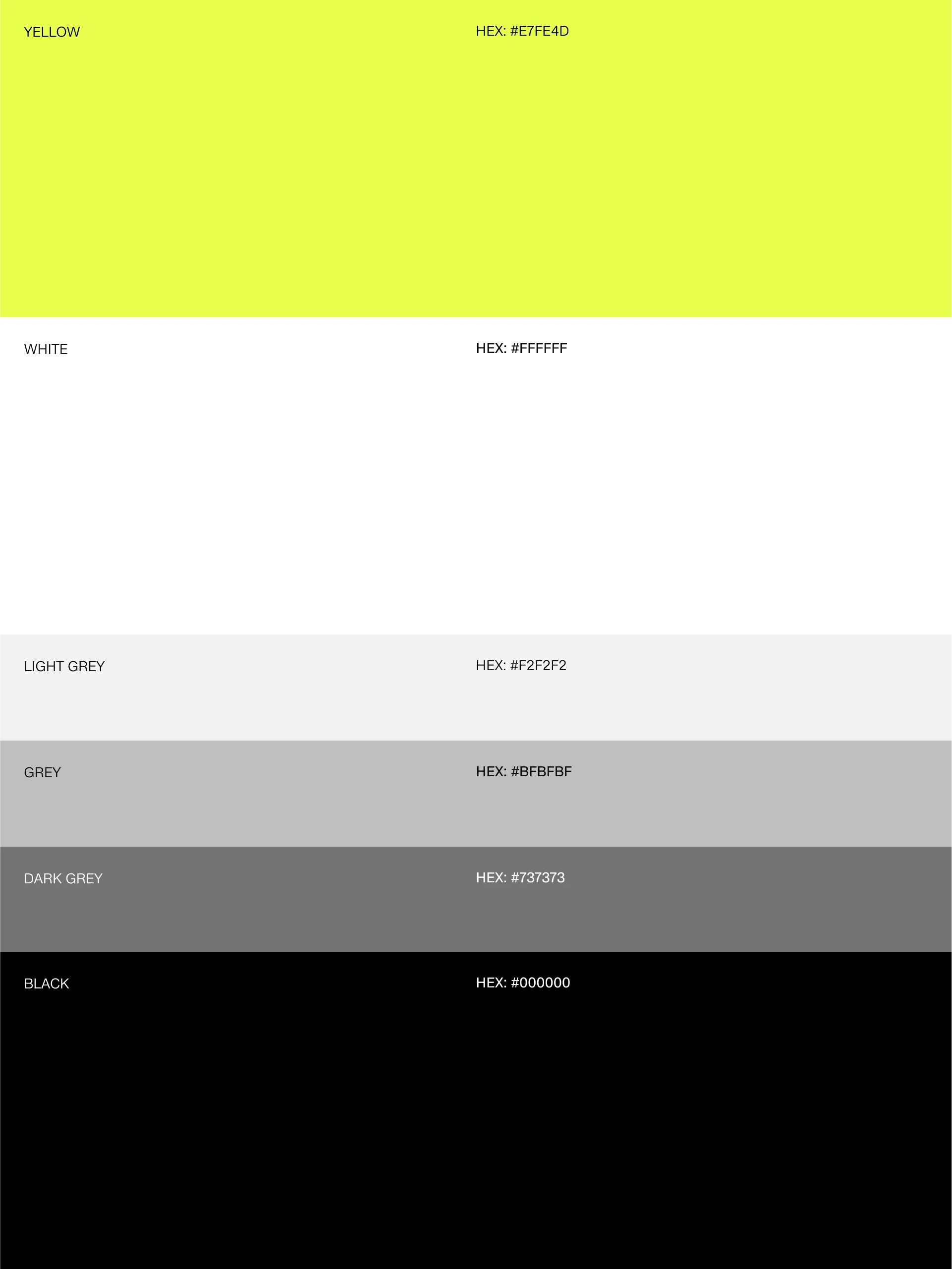
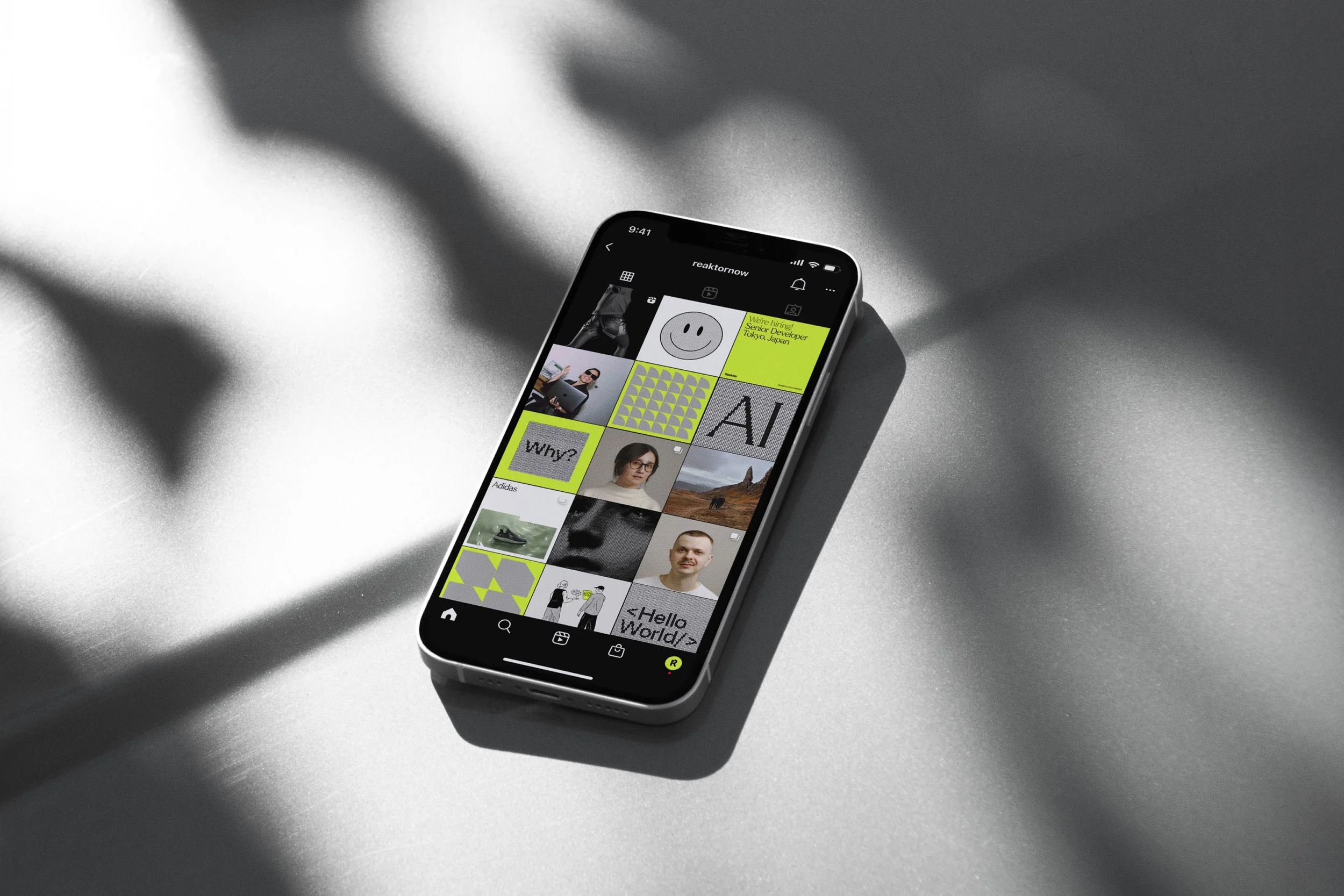
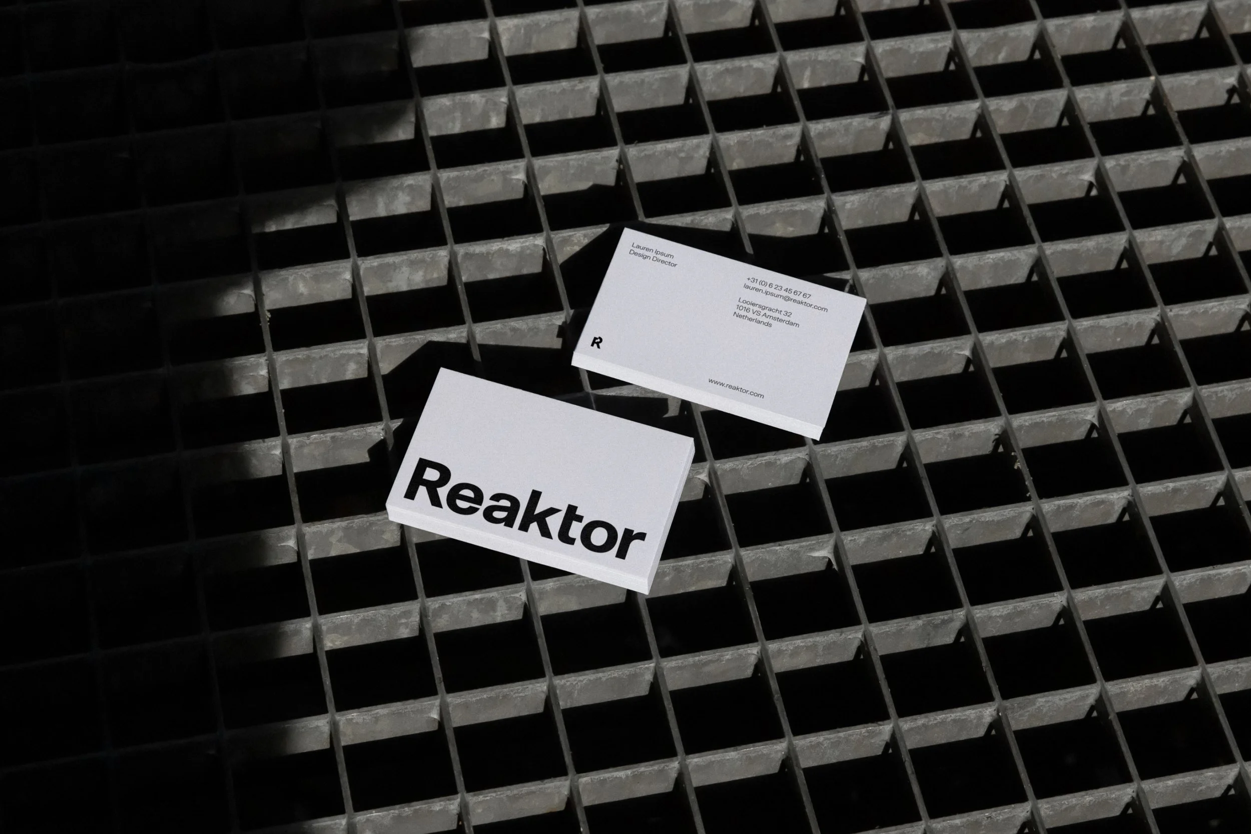
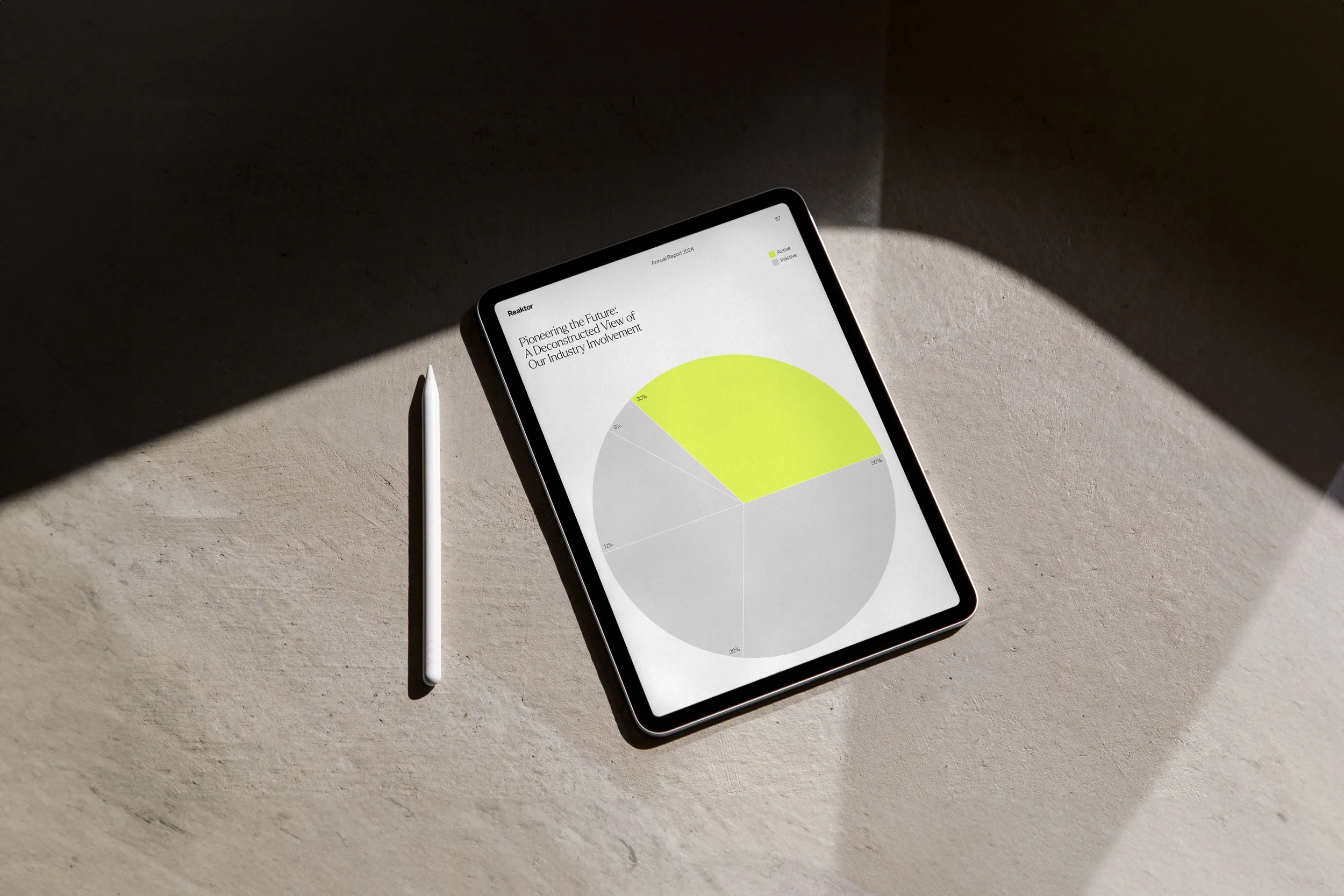
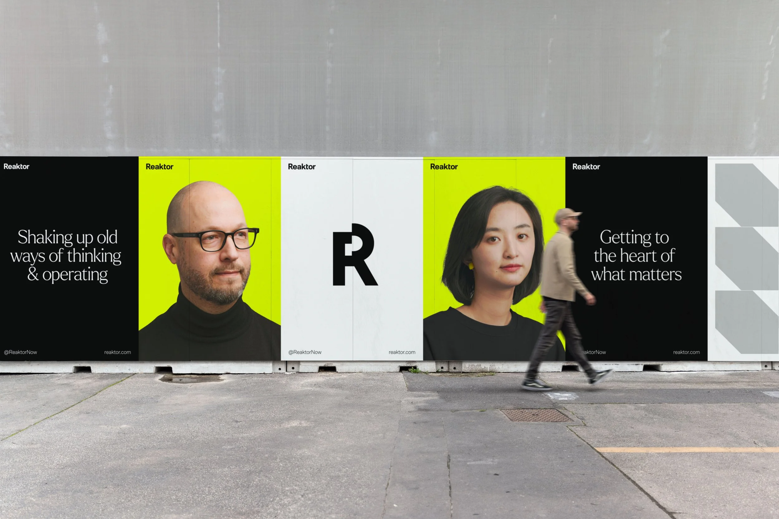
The identity was designed as a living, modular system, built to support global scale without losing clarity or character. At its core sits a minimal foundation of black, white, grey, and Reaktor yellow. Yellow acts as a strong brand signal, while a client-led colour option allows the system to adapt by borrowing a partner’s primary brand colour when needed, without compromising structure.
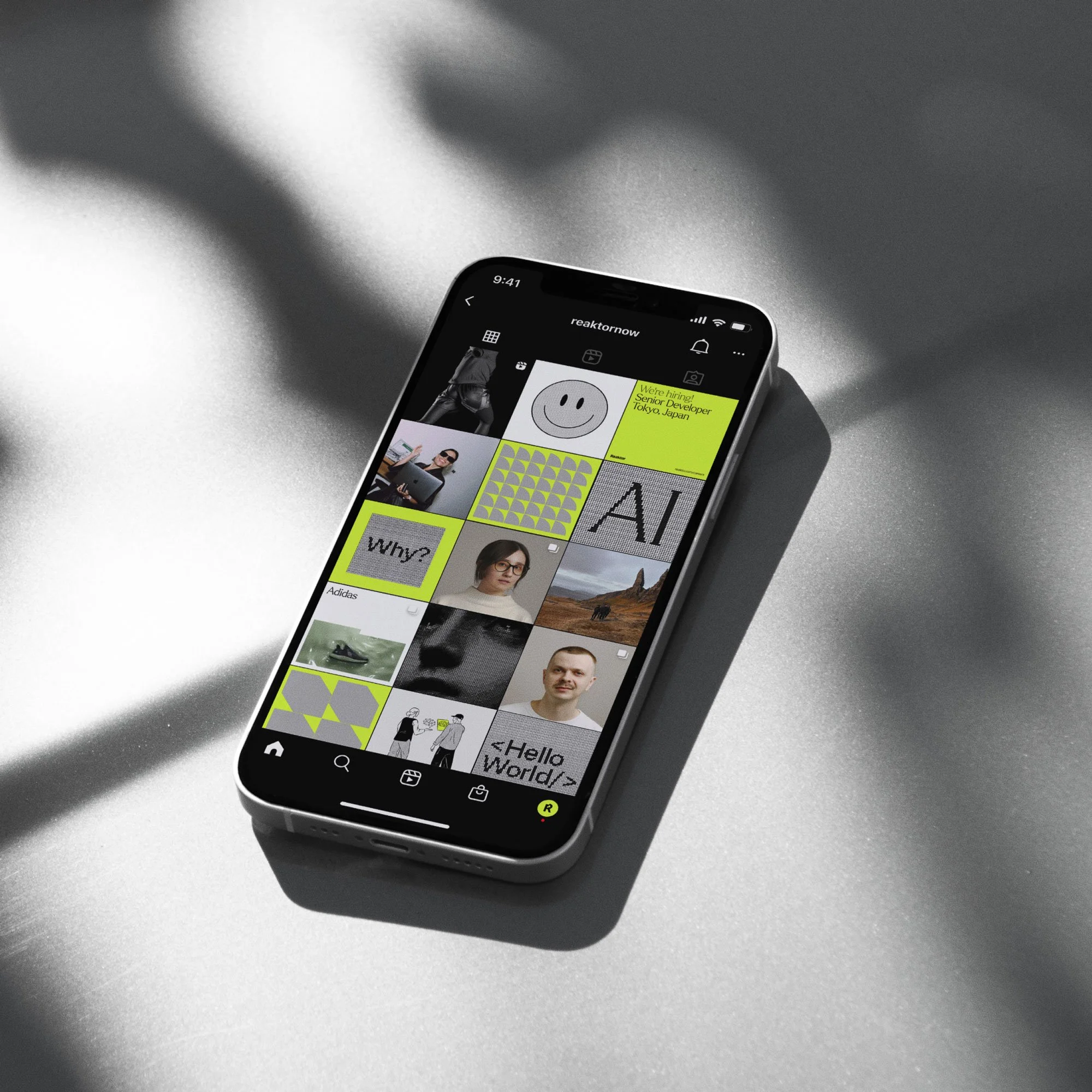
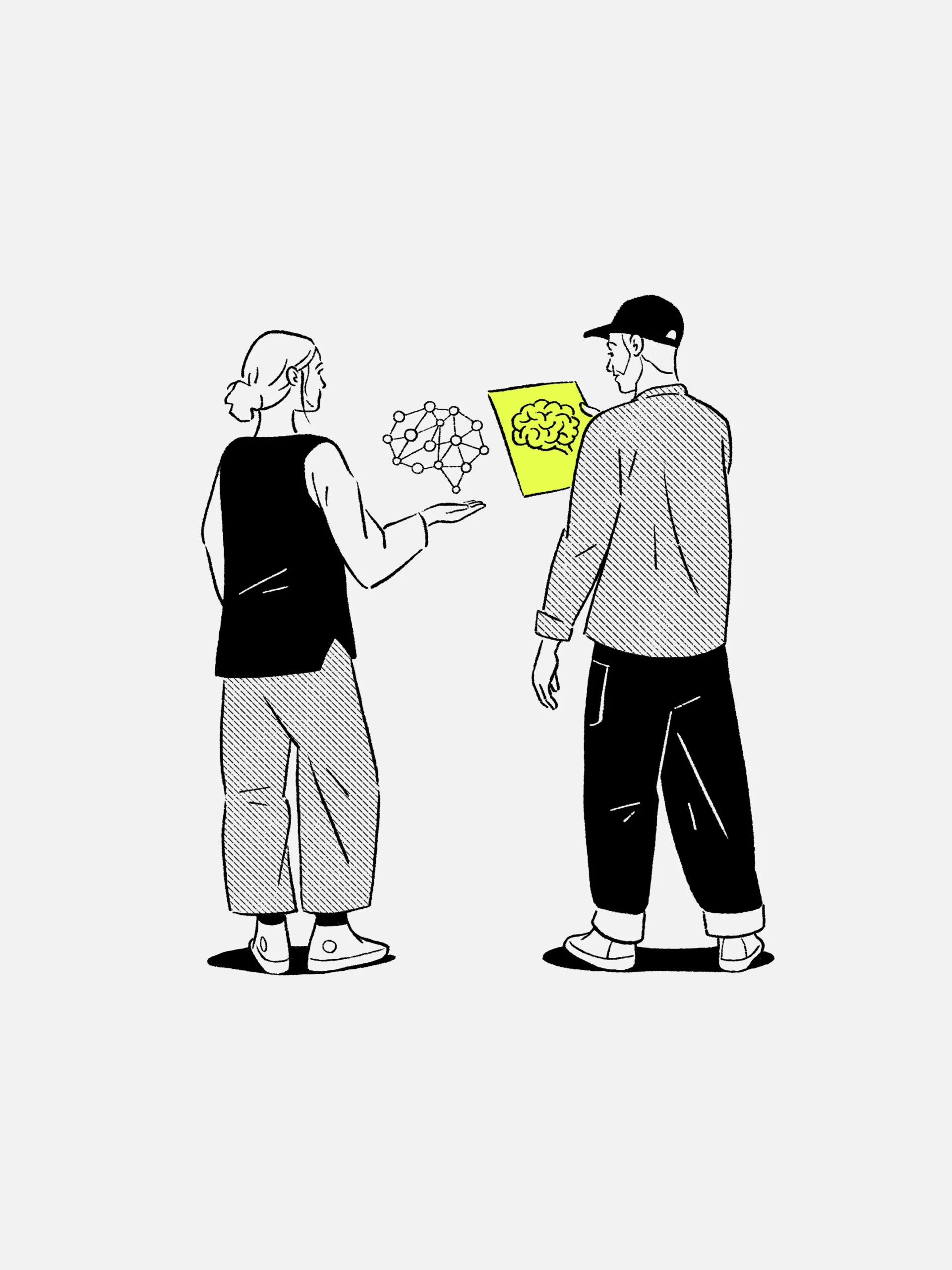
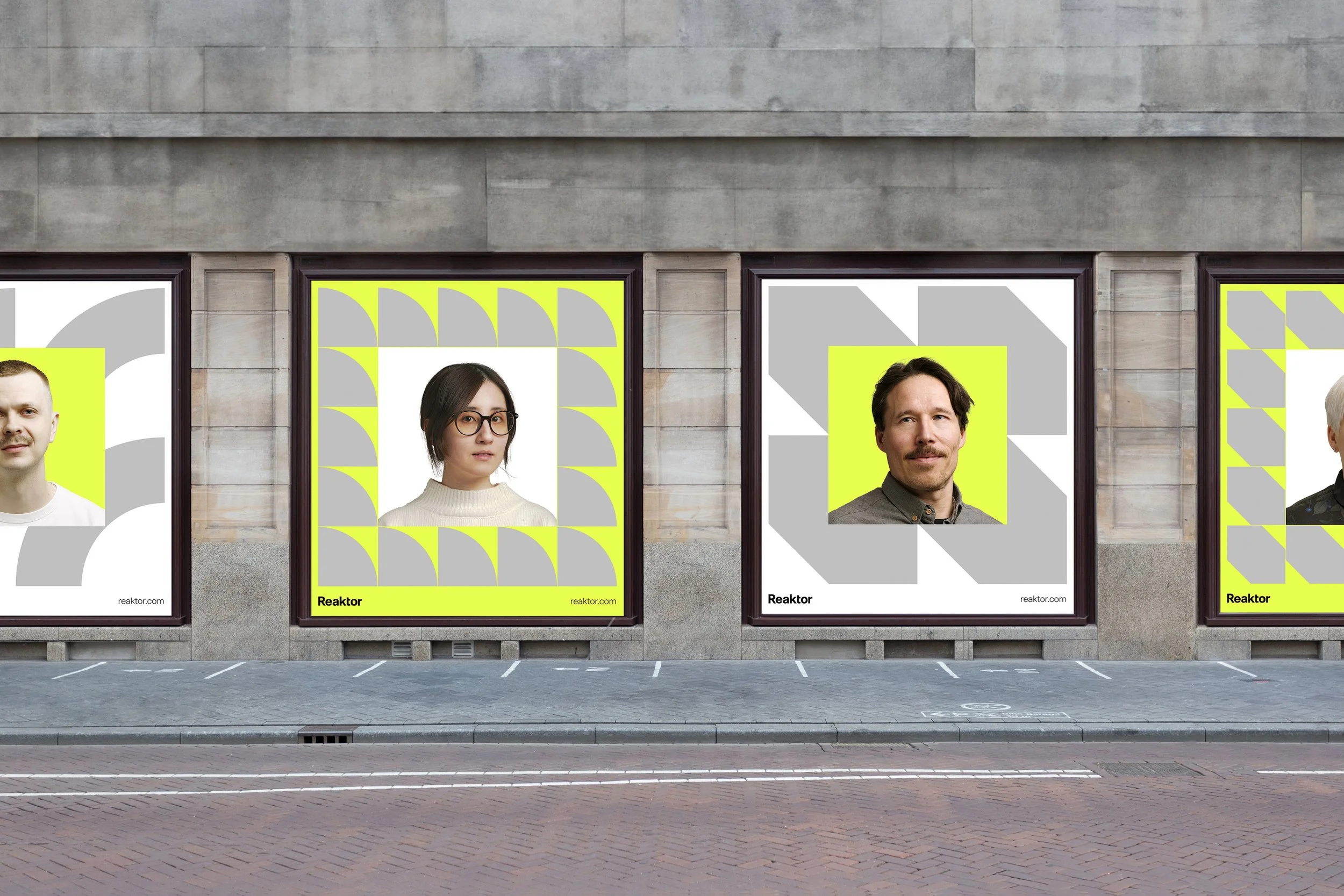
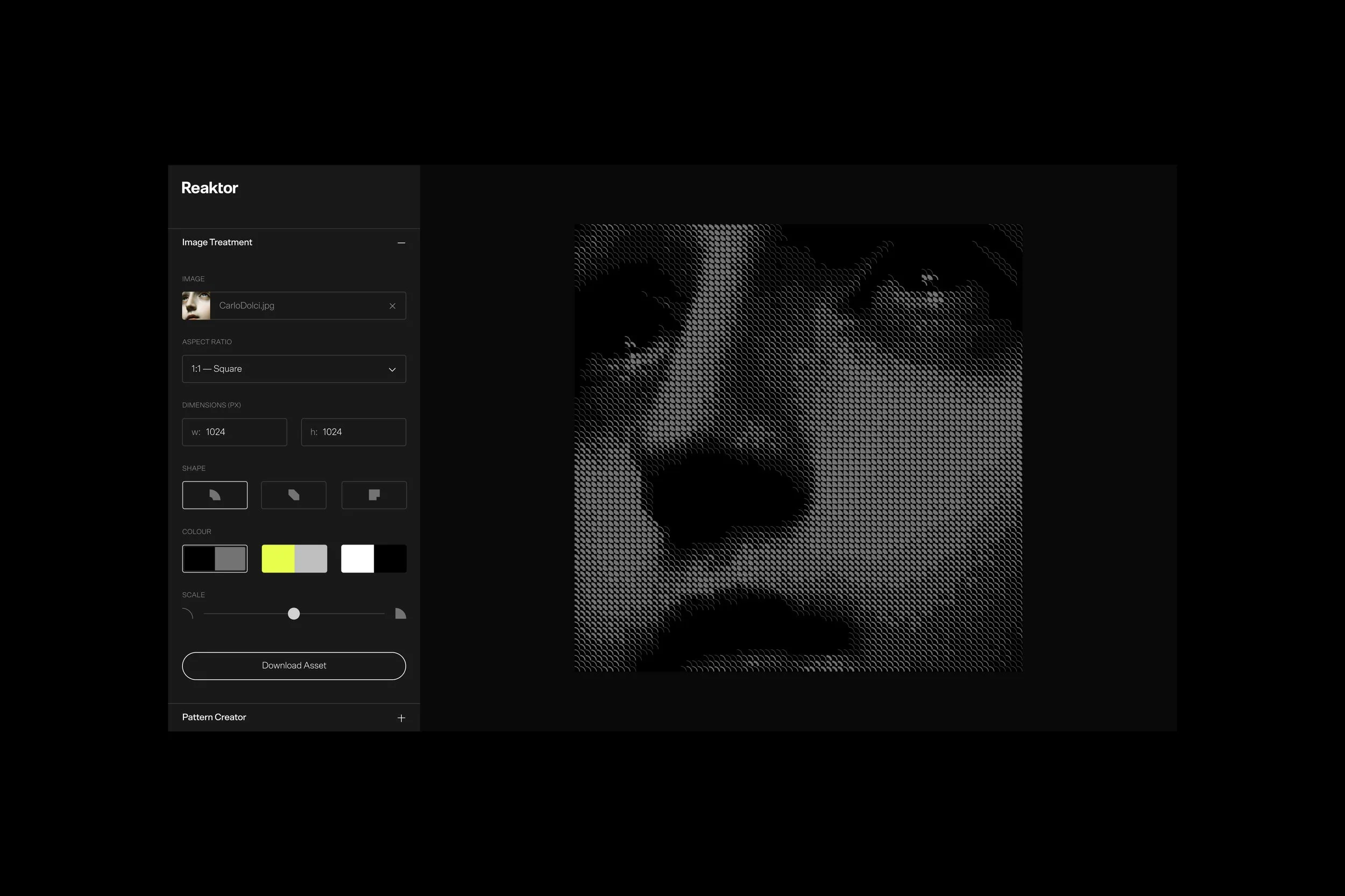
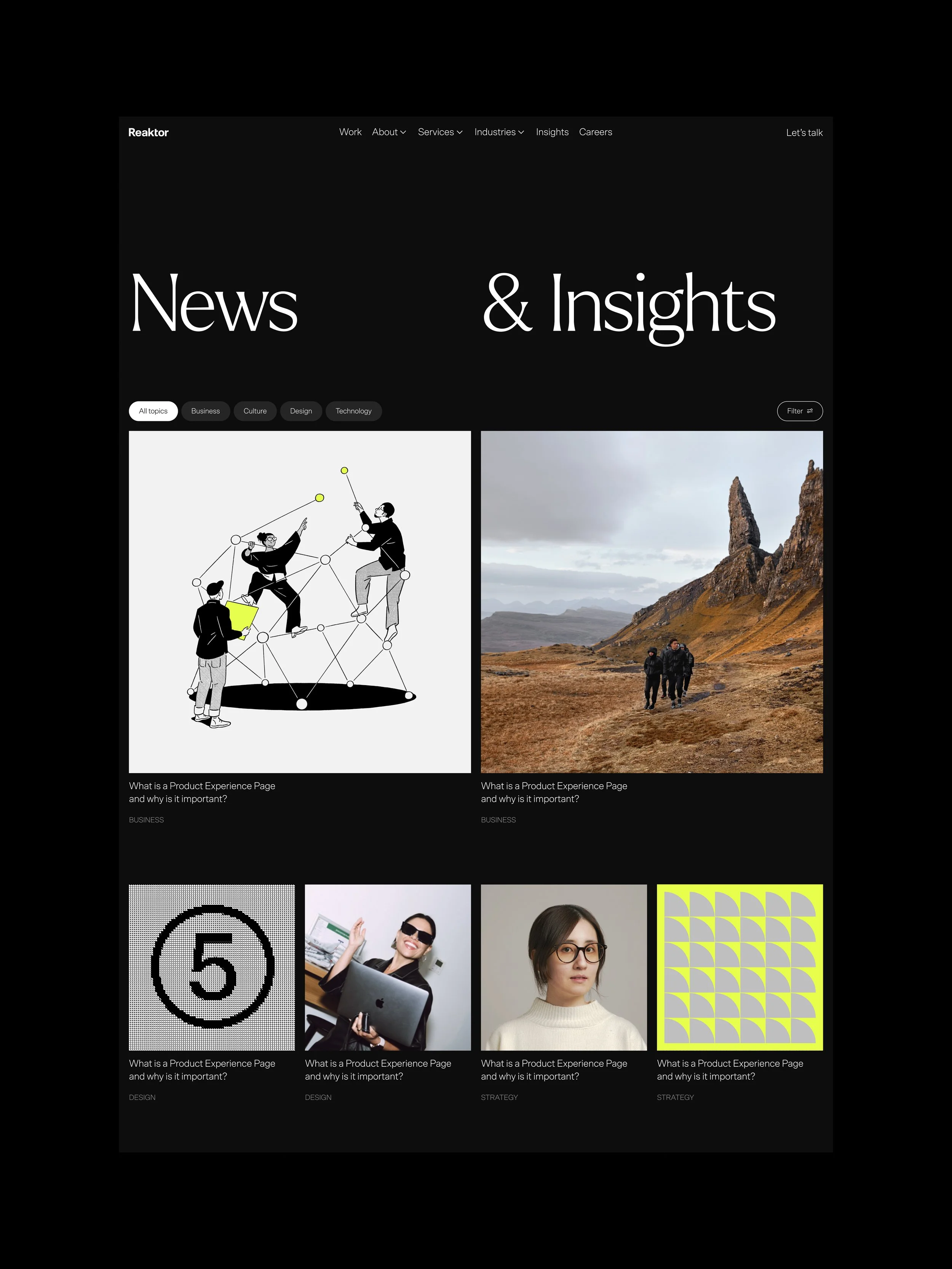
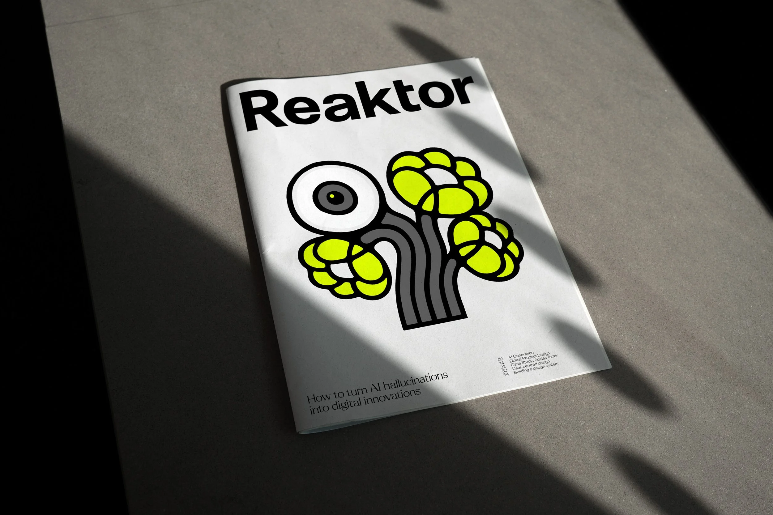
Expression is introduced in layers. At its most restrained, the system is purely typographic. As context demands, modular patterns, shapes, colour, illustration, photography, and motion can be introduced, giving teams the freedom to calibrate tone while remaining within a coherent framework.
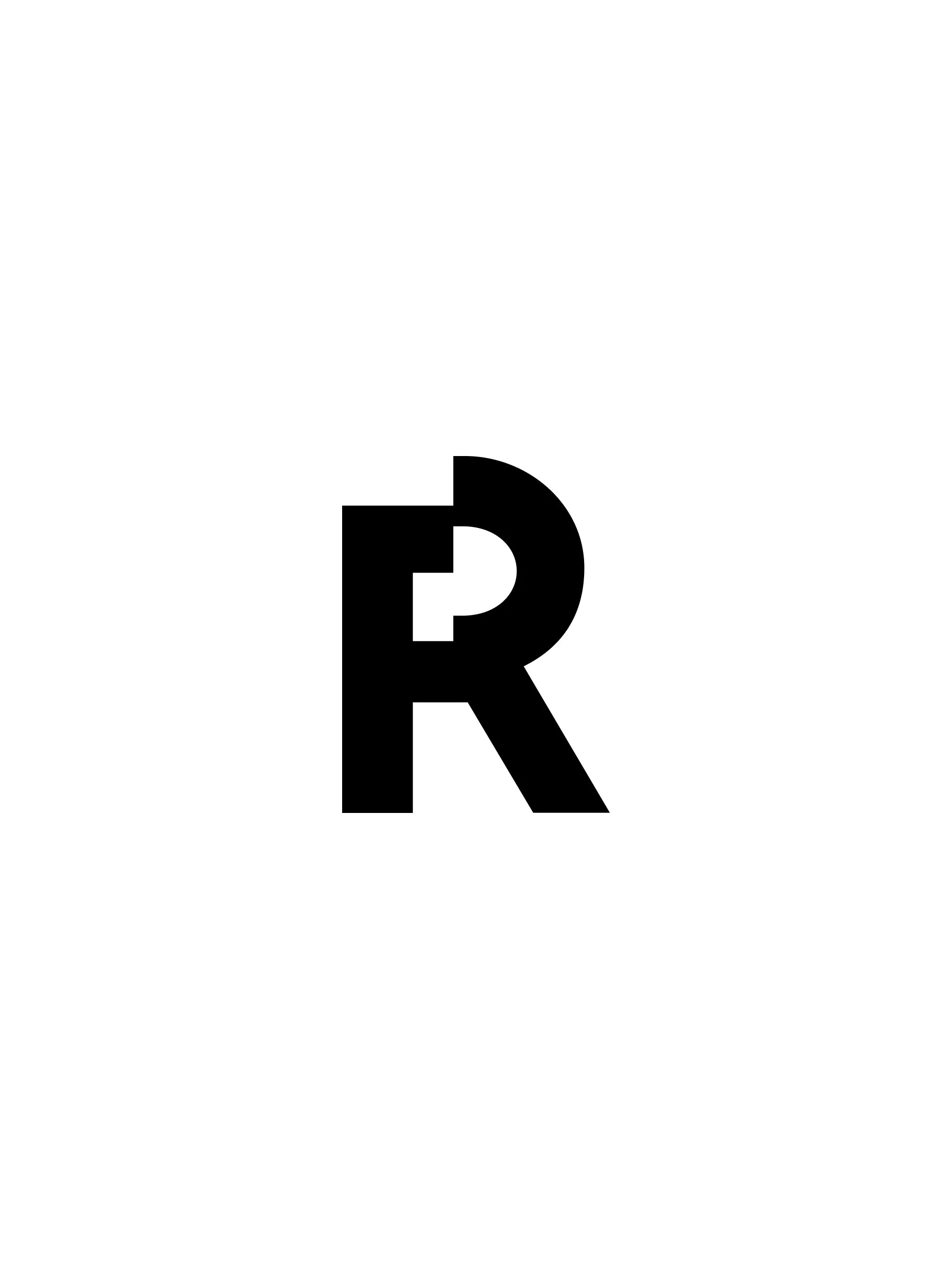
Typography and layout establish clarity and confidence. Graphic elements introduce rhythm and energy. Motion plays a central role, with a dynamic ‘R’ symbol and a system of split transitions and reveals that bring movement and depth to the identity. Together, these elements balance rigour with creative expression.
The identity was designed as a living, modular system, built to support global scale without losing clarity or character. At its core sits a minimal foundation of black, white, grey, and Reaktor yellow. Yellow acts as a strong brand signal, while a client-led colour option allows the system to adapt by borrowing a partner’s primary brand colour when needed, without compromising structure.
Expression is introduced in layers. At its most restrained, the system is purely typographic. As context demands, modular patterns, shapes, colour, illustration, photography, and motion can be introduced, giving teams the freedom to calibrate tone while remaining within a coherent framework.
Typography and layout establish clarity and confidence. Graphic elements introduce rhythm and energy. Motion plays a central role, with a dynamic ‘R’ symbol and a system of split transitions and reveals that bring movement and depth to the identity. Together, these elements balance rigour with creative expression.
The identity was designed as a living, modular system, built to support global scale without losing clarity or character. At its core sits a minimal foundation of black, white, grey, and Reaktor yellow. Yellow acts as a strong brand signal, while a client-led colour option allows the system to adapt by borrowing a partner’s primary brand colour when needed, without compromising structure.
Expression is introduced in layers. At its most restrained, the system is purely typographic. As context demands, modular patterns, shapes, colour, illustration, photography, and motion can be introduced, giving teams the freedom to calibrate tone while remaining within a coherent framework.
Typography and layout establish clarity and confidence. Graphic elements introduce rhythm and energy. Motion plays a central role, with a dynamic ‘R’ symbol and a system of split transitions and reveals that bring movement and depth to the identity. Together, these elements balance rigour with creative expression.






(Outcome)
(Outcome)
(Outcome)
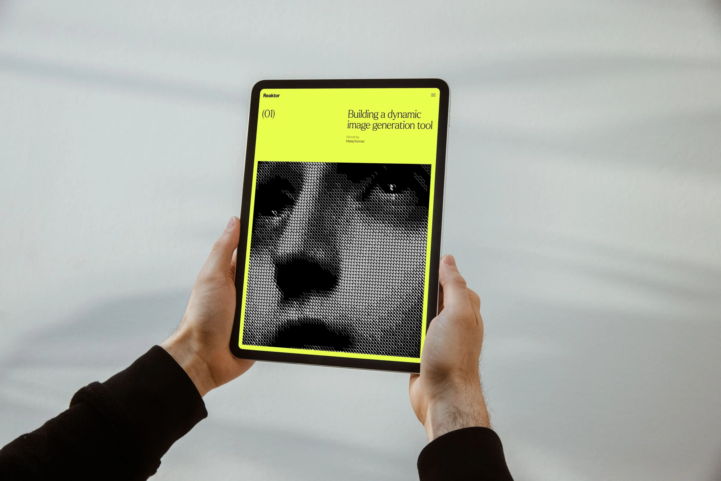
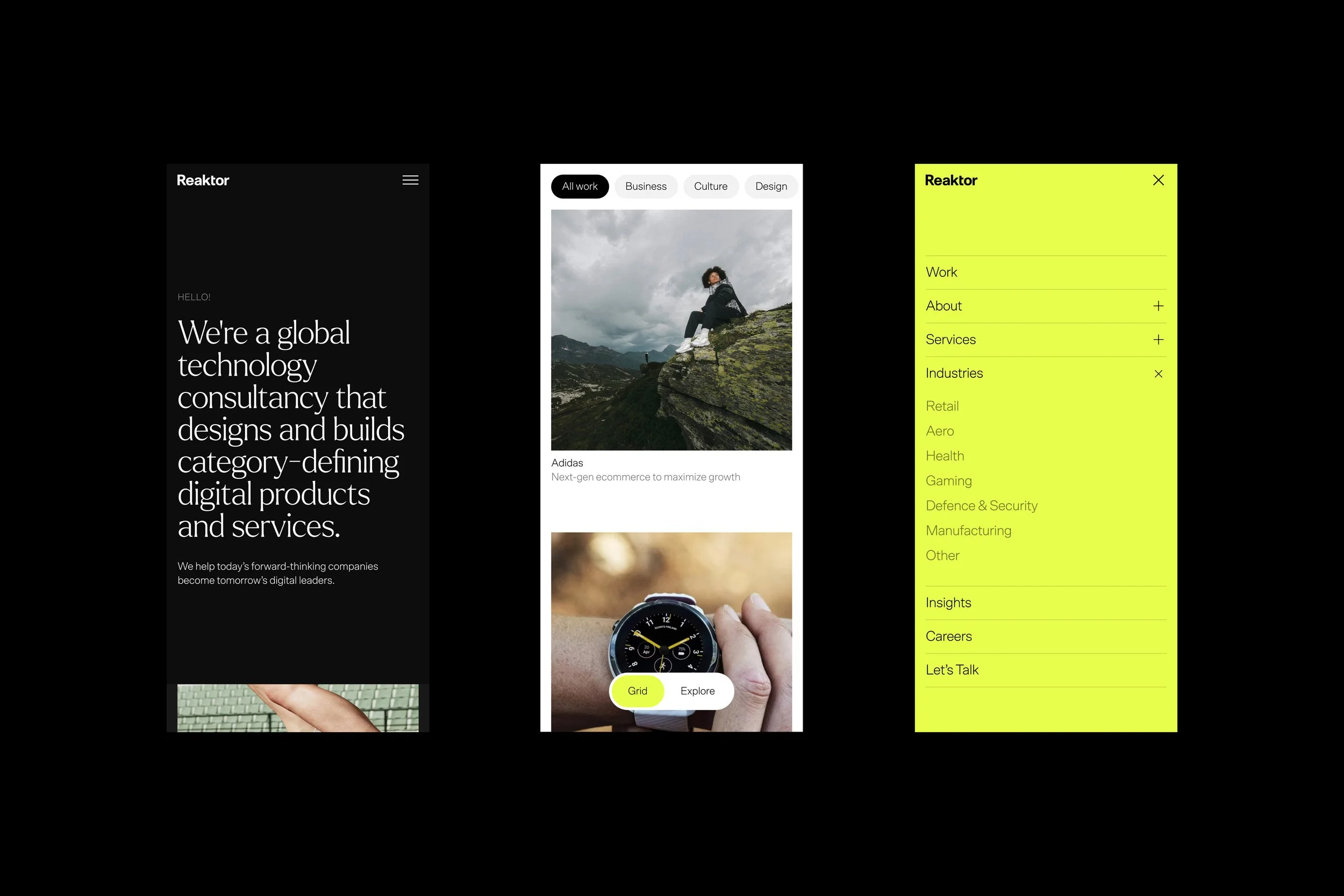
The result is a cohesive identity system built for scale, supported by clear guidelines, layered expression, and a new website at its core.
To enable confident adoption, we delivered a comprehensive design system, global brand portal, and a suite of ready-to-use templates for decks, documentation, social, and editorial content. These tools give teams the autonomy to create with consistency, allowing Reaktor’s Culture of Better to live clearly and coherently across regions, disciplines, and touchpoints.
The result is a cohesive identity system built for scale, supported by clear guidelines, layered expression, and a new website at its core.
To enable confident adoption, we delivered a comprehensive design system, global brand portal, and a suite of ready-to-use templates for decks, documentation, social, and editorial content. These tools give teams the autonomy to create with consistency, allowing Reaktor’s Culture of Better to live clearly and coherently across regions, disciplines, and touchpoints.
The result is a cohesive identity system built for scale, supported by clear guidelines, layered expression, and a new website at its core.
To enable confident adoption, we delivered a comprehensive design system, global brand portal, and a suite of ready-to-use templates for decks, documentation, social, and editorial content. These tools give teams the autonomy to create with consistency, allowing Reaktor’s Culture of Better to live clearly and coherently across regions, disciplines, and touchpoints.
(Testimonial)
I led marketing at Reaktor during our full brand and website renewal, and Aaron was the Creative Director and my closest partner throughout the project. He’s an exceptionally talented designer with a refined eye and judgement that extends far beyond aesthetics. What sets Aaron apart is his rare combination of creative excellence and genuine commercial understanding. He has a deep grasp of business, sales, and marketing, which meant the brand and identity he created didn’t just look great but strengthened our commercial positioning and gave the entire organisation something to rally behind. Aaron led the design team with conviction and was a true partner to marketing and sales throughout the transformation. Few creative directors combine that level of craft with that kind of business instinct, and he made the entire process genuinely enjoyable.

Kristiina Ranki
VP Marketing, Reaktor
(Testimonial)
I led marketing at Reaktor during our full brand and website renewal, and Aaron was the Creative Director and my closest partner throughout the project. He’s an exceptionally talented designer with a refined eye and judgement that extends far beyond aesthetics. What sets Aaron apart is his rare combination of creative excellence and genuine commercial understanding. He has a deep grasp of business, sales, and marketing, which meant the brand and identity he created didn’t just look great but strengthened our commercial positioning and gave the entire organisation something to rally behind. Aaron led the design team with conviction and was a true partner to marketing and sales throughout the transformation. Few creative directors combine that level of craft with that kind of business instinct, and he made the entire process genuinely enjoyable.
Kristiina Ranki
VP Marketing, Reaktor
(Testimonial)
I led marketing at Reaktor during our full brand and website renewal, and Aaron was the Creative Director and my closest partner throughout the project. He’s an exceptionally talented designer with a refined eye and judgement that extends far beyond aesthetics. What sets Aaron apart is his rare combination of creative excellence and genuine commercial understanding. He has a deep grasp of business, sales, and marketing, which meant the brand and identity he created didn’t just look great but strengthened our commercial positioning and gave the entire organisation something to rally behind. Aaron led the design team with conviction and was a true partner to marketing and sales throughout the transformation. Few creative directors combine that level of craft with that kind of business instinct, and he made the entire process genuinely enjoyable.
Kristiina Ranki
VP Marketing, Reaktor
(Testimonial)
I led marketing at Reaktor during our full brand and website renewal, and Aaron was the Creative Director and my closest partner throughout the project. He’s an exceptionally talented designer with a refined eye and judgement that extends far beyond aesthetics. What sets Aaron apart is his rare combination of creative excellence and genuine commercial understanding. He has a deep grasp of business, sales, and marketing, which meant the brand and identity he created didn’t just look great but strengthened our commercial positioning and gave the entire organisation something to rally behind. Aaron led the design team with conviction and was a true partner to marketing and sales throughout the transformation. Few creative directors combine that level of craft with that kind of business instinct, and he made the entire process genuinely enjoyable.
Kristiina Ranki
VP Marketing, Reaktor
(Credits)
(Credits)
Design
Design
Design
Aaron Darveniza
Alex Cruz
Kay Hooijmans
Jade Sunderland
Vanessa Wong
Aaron Darveniza
Alex Cruz
Kay Hooijmans
Jade Sunderland
Vanessa Wong
Aaron Darveniza
Alex Cruz
Kay Hooijmans
Jade Sunderland
Vanessa Wong
Marketing
Marketing
Marketing
Kristiina Ranki
Kristiina Ranki
Kristiina Ranki
Development
Development
Development
Aatu Väisänen
Matej Konrad
Aatu Väisänen
Matej Konrad
Aatu Väisänen
Matej Konrad
Illustration
Illustration
Illustration
Photography
Photography
Photography
Harvey Wilson
Harvey Wilson
Harvey Wilson