A typeface for CNN Style
A typeface for CNN Style
A typeface for CNN Style
Typography as identity.
Typography as identity.
Typography as identity.


When I worked on the redesign of CNN Style, I found typography to be one of the clearest ways to give the publication its own character while still feeling part of CNN. CNN Style covered architecture, art, design, fashion and culture, so it needed a visual language with a bit more personality than a standard news product. The challenge was to find something that felt editorial and distinctive without disconnecting from the wider CNN brand.
That led to working with A2-Type on a custom display typeface for the identity. Rather than treating typography as something added at the end, it became part of how CNN Style expressed itself across headlines, features and the wider digital experience. I have always liked that approach to identity. A logo is only one part of how a brand becomes recognisable. Type, layout, image treatment, motion and information structure can often do just as much of the work.
When I worked on the redesign of CNN Style, I found typography to be one of the clearest ways to give the publication its own character while still feeling part of CNN. CNN Style covered architecture, art, design, fashion and culture, so it needed a visual language with a bit more personality than a standard news product. The challenge was to find something that felt editorial and distinctive without disconnecting from the wider CNN brand.
That led to working with A2-Type on a custom display typeface for the identity. Rather than treating typography as something added at the end, it became part of how CNN Style expressed itself across headlines, features and the wider digital experience. I have always liked that approach to identity. A logo is only one part of how a brand becomes recognisable. Type, layout, image treatment, motion and information structure can often do just as much of the work.
When I worked on the redesign of CNN Style, I found typography to be one of the clearest ways to give the publication its own character while still feeling part of CNN. CNN Style covered architecture, art, design, fashion and culture, so it needed a visual language with a bit more personality than a standard news product. The challenge was to find something that felt editorial and distinctive without disconnecting from the wider CNN brand.
That led to working with A2-Type on a custom display typeface for the identity. Rather than treating typography as something added at the end, it became part of how CNN Style expressed itself across headlines, features and the wider digital experience. I have always liked that approach to identity. A logo is only one part of how a brand becomes recognisable. Type, layout, image treatment, motion and information structure can often do just as much of the work.


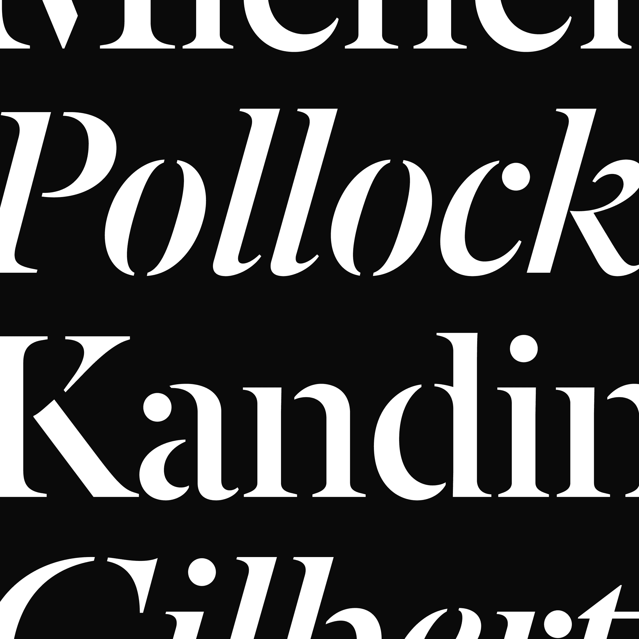


For CNN Style, the custom type gave the publication a voice of its own while still sitting comfortably inside a larger organisation. It was a relatively focused part of the project, but it carried much of the character.
Made while working independently with CNN, in collaboration with A2-Type.
For CNN Style, the custom type gave the publication a voice of its own while still sitting comfortably inside a larger organisation. It was a relatively focused part of the project, but it carried much of the character.
Made while working independently with CNN,
in collaboration with A2-Type.
For CNN Style, the custom type gave the publication a voice of its own while still sitting comfortably inside a larger organisation. It was a relatively focused part of the project, but it carried much of the character.
Made while working independently with CNN,
in collaboration with A2-Type.
Words
Aaron Darveniza
Published
12 September 2026


